


Welcome To Our Blog!
Unlock the Power of Digital Marketing: Expert Strategies, Trends, and Insights Await!
- All Posts
- AI
- Brand voice
- Brand strategy
- Company Reviews
- Reviews
- Reputation
- Marketing
- Social Media
- Content
- Blog
- Video Blogging
- Online Directories
- Marketing Strategy
- Website
- SEO
- Traffic
- Lead Generation
- Sales Funnel
- Email Marketing
- Advertising
- Marketing Tools
- Business
- E-Commerce
- Email Strategies
- PPC
- Keywords
- GBP
- Landing Pages
- Black Friday Tips
- Search Engines
- Backlinks
- Dominating Local Market
- SEO Strategy
- Keywords
- YouTube
- Online Directories
- SMS Marketing
- Email Marketing
- Referrals
- Selling Tips
- Sales Strategy
- Customer Retention
- Tik Tok
- Chat bots
- Video
- Social Media Strategy
- Influencers
- Brand Loyalty
- Paid Ads
- Customer Journey
- Zero Click
- Answer Engine Optimization
- Webinar
- Local Marketing
- AI Search
- Voice Search
- Search Box Optimization
- Search Price Optimization
- Google Map Pack
- Domain Authority
- semantic search
- event marketing
- Podcast
- Featured Clients
- Google Ads
- Backlinks
- Video Content
- storytelling content
- Life Advantage Series
- Latest News
- AI Agents
- Business Mastery
- Quora
- Bing
- GeoFencing
OUR LATEST [CATEGORY] POSTS
Lorem ipsum dolor sit amet, consectetur adipisicing elit, sed do eiusmod tempor incididunt ut labore et dolore magna aliqua.
There Are No Blog Posts To Show In The RSS Link You've Provided,
Please Try A Different Blog Posts RSS Link


There Are No Blog Posts To Show In The RSS Link You've Provided,
Please Try A Different Blog Posts RSS Link
Don't Ever Miss Out On A New Post
SUBMIT FORM
Removed Automation Delay
Added Automation Delay
No Active Automations
{"name":"Subscribe","action_type":"1","optin_action_type":"5","form_redirect_type":"1","form_redirect_funnel_url":"next-funnel","form_redirect_custom_url":"","order_form_settings":{"containers":[{"id":"personal-info-wrapper","visible":true,"label":{"id":"of-personal-title","visible":true},"fields":[{"id":"of-full-name","setting":false,"placeholder":"Full Name"},{"id":"of-field-email","setting":false,"placeholder":"Email Address"},{"id":"of-phone-number","setting":true,"visible":false,"require":true,"placeholder":"Enter Your Mobile Phone","additional":{"sms_permission":0}},{"id":"of-gdpr-optin-approval","label":"I Accept To Receive Additional Info","placeholder":"","icon":"fa-mobile","required":0,"visible":0,"system":1,"additional":{"gdpr_optin_approval":"1"}}]},{"id":"shipping-information-wrapper","visible":false,"label":{"id":"of-shipping-title","visible":true},"fields":[{"id":"of-shipping-address","setting":false,"placeholder":"Address"},{"id":"of-shipping-city","setting":false,"placeholder":"City"},{"id":"of-shipping-state","setting":false,"placeholder":"State"},{"id":"of-shipping-zipcode","setting":false,"placeholder":"Postal Code"}]},{"id":"profit-bump-wrapper","visible":true,"otoBgColor":"rgba(219,229,239,1)","otoBorderColor":"rgba(38,71,102,1)","otoTitleBgColor":"rgba(45,78,108,1)","otoArrowsColor":"rgba(255,177,58,1)","fields":[]},{"id":"order-summary-wrapper","visible":true,"orderDynamicBgColor":"rgba(242,242,242,1)","orderDynamicTexColor":"rgba(51,51,51,1)","fields":[]}]},"optin_type":{"showLabels":0,"fields":[{"name":"first_name","label":"First Name","placeholder":"Enter Your Full Name","icon":"fa-user","required":1,"visible":1,"system":1,"additional":{}},{"name":"last_name","label":"First Name","placeholder":"Enter Your Full Name","icon":"fa-user","required":1,"visible":1,"system":1,"additional":{}},{"name":"email","label":"Email","placeholder":"Enter Your Email","icon":"fa-envelope","required":1,"visible":1,"system":1,"additional":{}},{"name":"mobile_phone","label":"Mobile Phone","placeholder":"Enter Your Mobile Phone","icon":"fa-mobile","required":1,"visible":0,"system":1,"additional":{"sms_permission":0}},{"name":"fields_labels","label":"","placeholder":"","icon":"","required":0,"visible":1,"system":1,"additional":{}},{"name":"captcha","label":"Captcha","placeholder":"","icon":"","required":1,"visible":1,"system":1,"additional":{}},{"name":"gdpr_optin_approval","label":"SSBBY2NlcHQgVG8gUmVjZWl2ZSBBZGRpdGlvbmFsIEluZm8=","placeholder":"","icon":"fa-mobile","required":0,"visible":1,"system":1,"additional":{"gdpr_optin_approval":"1","sms_permission":0}}],"customFields":[],"sortedFields":[{"name":"first_name","label":"First Name","placeholder":"Enter Your Full Name","icon":"fa-user","required":1,"visible":1,"system":1,"additional":{}},{"name":"email","label":"Email","placeholder":"Enter Your Email","icon":"fa-envelope","required":1,"visible":1,"system":1,"additional":{}},{"name":"mobile_phone","label":"Mobile Phone","placeholder":"Enter Your Mobile Phone","icon":"fa-mobile","required":1,"visible":0,"system":1,"additional":{"sms_permission":0}},{"name":"captcha","label":"Captcha","placeholder":"","icon":"","required":1,"visible":1,"system":1,"additional":{}}],"design":{"form_background_color":"rgb(245, 245, 245)","field_stroke":{"size":"1","color":"rgb(220, 220, 220)"},"field_icons":0,"button_color":"rgb(255, 158, 0)","button_stroke":{"size":"0","color":"rgba(255, 255, 255, 0.2)"},"button_box_shadow_color":"rgb(213, 139, 18) 0px 2px 0px 0px","field_size":"small","label_size":"16","label_color":"rgba(255,255,255,0)","input_color":"rgb(52, 152, 219)","control_text_color":"rgb(0, 0, 0)","control_text_size":"16"},"mappedFields":[]},"redirect_type":{"url":"","target":0},"next_step":{"value":"next-funnel"},"click_to_email":{"value":""},"click_to_call":{"value":""},"jump_to_block":{},"content":{"header_text":"PHNwYW4gc3R5bGU9ImZvbnQtc2l6ZToyNHB4OyBmb250LWZhbWlseTonb3BlbiBzYW5zJzsiPjxzcGFuIHN0eWxlPSJsaW5lLWhlaWdodDoxLjRlbTsiPldyaXRlIEFuIEVuZ2FnaW5nIFF1ZXN0aW9uIFJpZ2h0IEhlcmU/PC9zcGFuPjwvc3Bhbj4=","content_text":"PHNwYW4gc3R5bGU9ImZvbnQtc2l6ZTo0OHB4OyBmb250LWZhbWlseTonb3BlbiBzYW5zJzsiPjxzcGFuIHN0eWxlPSJsaW5lLWhlaWdodDowLjllbTsiPjxzdHJvbmc+SU5DTFVERSBZT1VSIE9GRkVSQkVORUZJVCBTVEFURU1FTlQgSEVSRTwvc3Ryb25nPjwvc3Bhbj48L3NwYW4+","button_text":"dW5kZWZpbmVk","spam_text":"PHNwYW4gc3R5bGU9ImxpbmUtaGVpZ2h0OjEuMmVtOyI+V2UgaGF0ZSBTUEFNIGFuZCBwcm9taXNlIHRvIGtlZXAgeW91ciBlbWFpbCBhZGRyZXNzIHNhZmU8L3NwYW4+","sms_text":"UmVjZWl2ZSBTTVMgVGV4dCBVcGRhdGVzIC0gPHNwYW4+b3B0aW9uYWw8L3NwYW4+","sms_text2":"SSBBY2NlcHQgVG8gUmVjZWl2ZSBBZGRpdGlvbmFsIEluZm8="},"email_confirmation":{"enable":0,"subject":"V2UgQXJlIEV4Y2l0ZWQhIFlvdXIgSW4h","message":"V2UgYXJlIHJlYWxseSBleGNpdGVkIHlvdSByZWFjaGVkIG91dCB0byBnZXQgbW9yZSBpbmZvcm1hdGlvbi48YnIgLz4KPGJyIC8+CllvdSYjMzk7cmUgbm93IG9uIHRoZSBsaXN0IHRvIGdldCBtb3JlIGluZm9ybWF0aW9uIGFuZCBzdGF5IHVwIHRvIGRhdGUgd2l0aCB3aGF0IHdlIGFyZSBkb2luZyBpbiB0aGUgaW5kdXN0cnkuPGJyIC8+CjxiciAvPgpJZiB5b3UgaGF2ZSBxdWVzdGlvbnMuIEZlZWwgZnJlZSB0byBjb250YWN0IHVzIG9yIGRyb3AgdXMgYW4gZW1haWwuPGJyIC8+CjxiciAvPgpIYXZlIEEgR3JlYXQgRGF5ISBXZSBsb29rIGZvcndhcmQgdG8gc2VuZGluZyB5b3UgbW9yZSBpbmZvcm1hdGlvbi48YnIgLz4KPGJyIC8+ClNpbmNlcmVseSw8YnIgLz4KPGJyIC8+CkRpYW5lIE8mIzM5O0JyaWVuPGJyIC8+CkRpZ2l0YWwgTWFya2V0aW5nIEFsbDxiciAvPgp3d3cuZGlnaXRhbG1hcmtldGluZ2FsbC5vcmc8YnIgLz4KMjA3LTcxMC0xNDQ5"},"integrations":[{"name":"Tag: Blog/Email Subscriber","action":"tag","integration_type":"prospectrocket","integration_id":1043,"campaign_id":174655,"campaign_name":"Blog/Email Subscriber","campaign_action":"add","tag_id":"","delay_time":0,"delay_period":"0,1","mappedFields":"W10=","additionalData":"e30="},{"name":"Campaign: Conversion Campaign","action":"campaign","integration_type":"prospectrocket","integration_id":1043,"campaign_id":6728,"campaign_name":"Conversion Campaign","campaign_action":"add","tag_id":"","delay_time":0,"delay_period":"0,1","mappedFields":"W10=","additionalData":"e30="}],"automation_enable":1,"thank_you":{"type":"popup","redirect_url":"","popup_options":{"background_color":"#ffffff","headline_visible":1,"icon_visible":1,"icon_url":"//my.funnelpages.com/assets-pb/images/thankyou-popup-icon.png","subheadline_visible":1,"button_visible":1,"button_color":"#ffa800","headline_text":"PHNwYW4gc3R5bGU9ImxpbmUtaGVpZ2h0OjEuNGVtOyI+VGhhbmsgWW91IEZvciBDb250YWN0aW5nIFVzPC9zcGFuPg==","subeadline_text":"PHNwYW4gc3R5bGU9ImxpbmUtaGVpZ2h0OjEuNGVtOyI+UGxlYXNlIENoZWNrIFlvdXIgRW1haWw8YnIgLz5XZSBXaWxsIEJlIEZvbGxvd2luZyBVcCBTaG9ydGx5PC9zcGFuPg==","button_text":"Q2xvc2U="}}}
HOURS
Monday 9AM-5PM
Tuesday 9AM-5PM
Wednesday 9AM-5PM
Thursday 9AM-5PM
Friday 9AM-5PM
Saturday/Sunday Closed
Tuesday 9AM-5PM
Wednesday 9AM-5PM
Thursday 9AM-5PM
Friday 9AM-5PM
Saturday/Sunday Closed
CONTACT
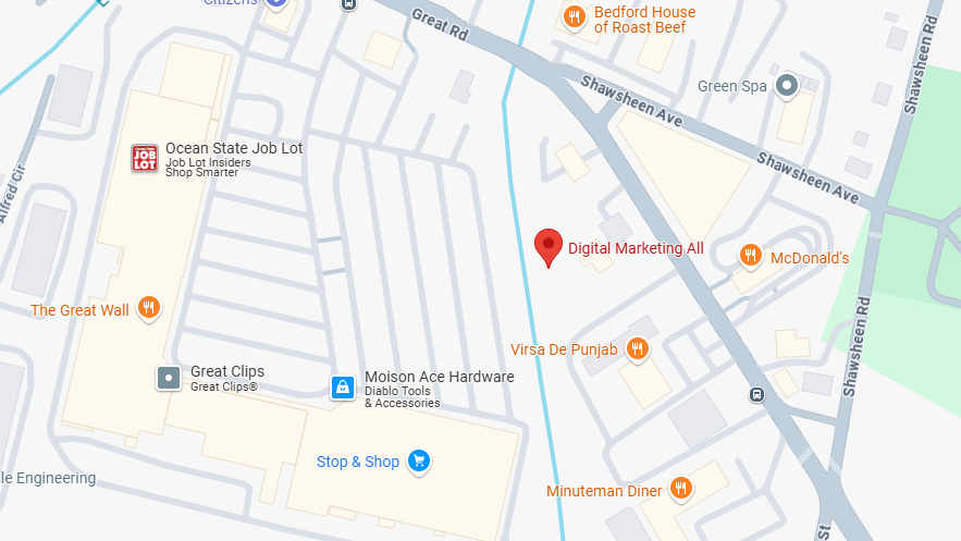
ADDRESS
30 Shawsheen Ave, Suite 3
Bedford, MA 01730
CONTACT US
Email: info@digitalmarketingall.org
Phone: (207)-710-1449
{"js":"CiAgICA8c2NyaXB0IHNyYz0naHR0cHM6Ly93aWRnZXQuY2x5bS1zZGsubmV0L2Jsb2NraW5nLmpzJz48L3NjcmlwdD4KICAgIDxzY3JpcHQ+CiAgICAoZnVuY3Rpb24oZCxpZCxzLGksdyxvKXsKICAgIHZhciBqcyxjanM9ZC5nZXRFbGVtZW50c0J5VGFnTmFtZShzKVswXSxjcz1kLmdldEVsZW1lbnRCeUlkKGlkKTsKICAgIGlmKGNzKXtpZih3aW5kb3cuQ2x5bSkgcmV0dXJuIENseW0ubG9hZChpLHcsbyk7dmFyIGM9d2luZG93Ll9jbHltSW5pdHx8W107Yy5wdXNoKFtpLHcsb10pO3dpbmRvdy5fY2x5bUluaXQ9YztyZXR1cm47fQogICAganM9ZC5jcmVhdGVFbGVtZW50KCdzY3JpcHQnKTsKICAgIGpzLmlkPWk7CiAgICBqcy5zcmM9J2h0dHBzOi8vd2lkZ2V0LmNseW0tc2RrLm5ldC9jbHltLmpzJzsKICAgIGpzLm9ubG9hZD1mdW5jdGlvbigpe0NseW0mJkNseW0ubG9hZChpLHcsbyk7fTsKICAgIGNqcy5wYXJlbnROb2RlLmluc2VydEJlZm9yZShqcywgY2pzKTsKICAgIH0oZG9jdW1lbnQsJ2NseW0tcHJpdmFjeScsJ3NjcmlwdCcsJ2NseW0tcHJpdmFjeScsJ2JiODVjY2U5NjI3NjQyY2FhYzNlYmZkZjAzNWtwdHloJyx7fSkpOwogICAgPC9zY3JpcHQ+Cg==","embed":""}
{"js":"","embed":"PHNjcmlwdCBzcmM9Imh0dHBzOi8vZGlnaXRhbG1hcmtldGluZ2FsbC5yZXZpZXdiYWRnZXMuY29tL3dlYnNpdGVfbWFya2V0aW5nL3Nob3dfcG9wdXBfd2lkZ2V0L1JLLTQ1NzkyLTQ3NjMwLTE2MTE3LXYyLmpzIj48L3NjcmlwdD48c2NyaXB0IHNyYz0iaHR0cHM6Ly9kaWdpdGFsbWFya2V0aW5nYWxsLnJldmlld2JhZGdlcy5jb20vd2Vic2l0ZV9tYXJrZXRpbmcvcmV0YXJnZXRpbmdfcGl4ZWwvUkstNDU3OTItNDc2MzAtMTYxMTctdjIuanMiPjwvc2NyaXB0Pg=="}
{"js":"PHNjcmlwdCB0eXBlPeKAnXRleHQvamF2YXNjcmlwdOKAnSBzcmM94oCdLy9zY3JpcHQud2ViY2hhdC5jb20vcGFnZXMvc2NyaXB0cy8wMTAyLzY3MDQuanPigJ1hc3luYz3igJ1hc3luY+KAnT48L3NjcmlwdD4KCg==","embed":"Cgo="}
© 2026 Digital Marketing All All Rights Reserved. 30 Shawsheen Ave, Suite 3, Bedford, MA 01730 . Contact Us . Terms of Service . Privacy Policy
eyJjb21wYW55IjoiRGlnaXRhbCBNYXJrZXRpbmcgQWxsIiwiYWRkcmVzcyI6IjMwIFNoYXdzaGVlbiBBdmUsIFN1aXQgMywgQmVkZm9yZCwgTUEgMDE3MzAiLCJjaXR5IjoiQmVkZm9yZCIsInN0YXRlIjoiTUEiLCJ6aXAiOiIwMTczMCIsImVtYWlsIjoiZGlhbmVAZGlnaXRhbG1hcmtldGluZ2FsbC5vcmciLCJ0b3MiOiJQSEErUEhOMGNtOXVaejQ4WlcwK1YyaGxiaUI1YjNVZ2MybG5iaTFwYmlCM2FYUm9JSFZ6TENCNWIzVWdZWEpsSUdkcGRtbHVaeVp1WW5Od095QjViM1Z5SUhCbGNtMXBjM05wYjI0Z1lXNWtJR052Ym5ObGJuUWdkRzhnYzJWdVpDQjViM1VnWlcxaGFXd2dZVzVrTDI5eUlGTk5VeUIwWlhoMElHMWxjM05oWjJWekxpQkNlU0JqYUdWamEybHVaeUIwYUdVZ1ZHVnliWE1nWVc1a0lFTnZibVJwZEdsdmJuTWdZbTk0SUdGdVpDQmllU0J6YVdkdWFXNW5JR2x1SUhsdmRTQmhkWFJ2YldGMGFXTmhiR3g1SUdOdmJtWnBjbTBnZEdoaGRDQjViM1VnWVdOalpYQjBJR0ZzYkNCMFpYSnRjeUJwYmlCMGFHbHpJR0ZuY21WbGJXVnVkQzQ4TDJWdFBqd3ZjM1J5YjI1blBqd3ZjRDRLQ2p4d1BqeGhJR2h5WldZOUltaDBkSEE2THk5M2QzY3VaMjl2WjJ4bExtTnZiU0krYUhSMGNEb3ZMM2QzZHk1bmIyOW5iR1V1WTI5dFBDOWhQand2Y0Q0S0NqeHdQaVp1WW5Od096d3ZjRDRLQ2p4d1BqeHpkSEp2Ym1jK1UwVlNWa2xEUlR3dmMzUnliMjVuUGp3dmNENEtDanh3UGxkbElIQnliM1pwWkdVZ1lTQnpaWEoyYVdObElIUm9ZWFFnWTNWeWNtVnVkR3g1SUdGc2JHOTNjeUI1YjNVZ2RHOGdjbVZqWldsMlpTQnlaWEYxWlhOMGN5Qm1iM0lnWm1WbFpHSmhZMnNzSUdOdmJYQmhibmtnYVc1bWIzSnRZWFJwYjI0c0lIQnliMjF2ZEdsdmJtRnNJR2x1Wm05eWJXRjBhVzl1TENCamIyMXdZVzU1SUdGc1pYSjBjeXdnWTI5MWNHOXVjeXdnWkdselkyOTFiblJ6SUdGdVpDQnZkR2hsY2lCdWIzUnBabWxqWVhScGIyNXpJSFJ2SUhsdmRYSWdaVzFoYVd3Z1lXUmtjbVZ6Y3lCaGJtUXZiM0lnWTJWc2JIVnNZWElnY0dodmJtVWdiM0lnWkdWMmFXTmxMaUJaYjNVZ2RXNWtaWEp6ZEdGdVpDQmhibVFnWVdkeVpXVWdkR2hoZENCMGFHVWdVMlZ5ZG1salpTQnBjeUJ3Y205MmFXUmxaQ0FtY1hWdmREdEJVeTFKVXlaeGRXOTBPeUJoYm1RZ2RHaGhkQ0IzWlNCaGMzTjFiV1VnYm04Z2NtVnpjRzl1YzJsaWFXeHBkSGtnWm05eUlIUm9aU0IwYVcxbGJHbHVaWE56TENCa1pXeGxkR2x2Yml3Z2JXbHpMV1JsYkdsMlpYSjVJRzl5SUdaaGFXeDFjbVVnZEc4Z2MzUnZjbVVnWVc1NUlIVnpaWElnWTI5dGJYVnVhV05oZEdsdmJuTWdiM0lnY0dWeWMyOXVZV3hwZW1GMGFXOXVJSE5sZEhScGJtZHpMand2Y0Q0S0NqeHdQbGx2ZFNCaGNtVWdjbVZ6Y0c5dWMybGliR1VnWm05eUlHOWlkR0ZwYm1sdVp5QmhZMk5sYzNNZ2RHOGdkR2hsSUZObGNuWnBZMlVnWVc1a0lIUm9ZWFFnWVdOalpYTnpJRzFoZVNCcGJuWnZiSFpsSUhSb2FYSmtJSEJoY25SNUlHWmxaWE1nS0hOMVkyZ2dZWE1nVTAxVElIUmxlSFFnYldWemMyRm5aWE1zSUVsdWRHVnlibVYwSUhObGNuWnBZMlVnY0hKdmRtbGtaWElnYjNJZ1kyVnNiSFZzWVhJZ1lXbHlkR2x0WlNCamFHRnlaMlZ6S1M0Z1dXOTFJR0Z5WlNCeVpYTndiMjV6YVdKc1pTQm1iM0lnZEdodmMyVWdabVZsY3l3Z2FXNWpiSFZrYVc1bklIUm9iM05sSUdabFpYTWdZWE56YjJOcFlYUmxaQ0IzYVhSb0lIUm9aU0JrYVhOd2JHRjVJRzl5SUdSbGJHbDJaWEo1SUc5bUlHVmhZMmdnVTAxVElIUmxlSFFnYldWemMyRm5aU0J6Wlc1MElIUnZJSGx2ZFNCaWVTQjFjeTRnU1c0Z1lXUmthWFJwYjI0c0lIbHZkU0J0ZFhOMElIQnliM1pwWkdVZ1lXNWtJR0Z5WlNCeVpYTndiMjV6YVdKc1pTQm1iM0lnWVd4c0lHVnhkV2x3YldWdWRDQnVaV05sYzNOaGNua2dkRzhnWVdOalpYTnpJSFJvWlNCVFpYSjJhV05sSUdGdVpDQnlaV05sYVhabElIUm9aU0JUVFZNZ2RHVjRkQ0J0WlhOellXZGxjeTRnVjJVZ1pHOGdibTkwSUdOb1lYSm5aU0JoYm5rZ1ptVmxjeUJtYjNJZ1pHVnNhWFpsY25rZ2IyWWdaVzFoYVd3Z2IzSWdVMDFUTGlCVWFHbHpJR2x6SUdFZ1puSmxaU0J6WlhKMmFXTmxJSEJ5YjNacFpHVmtJR0o1SUhWekxpQkliM2RsZG1WeUxDQndiR1ZoYzJVZ1kyaGxZMnNnZDJsMGFDQjViM1Z5SUdsdWRHVnlibVYwSUhObGNuWnBZMlVnY0hKdmRtbGtaWElnWVc1a0lHTmxiR3gxYkdGeUlHTmhjbkpwWlhJZ1ptOXlJR0Z1ZVNCamFHRnlaMlZ6SUhSb1lYUWdiV0Y1SUdsdVkzVnlJR0Z6SUdFZ2NtVnpkV3gwSUdaeWIyMGdjbVZqWldsMmFXNW5JR1Z0WVdsc0lHRnVaQ0JUVFZNZ2RHVjRkQ0J0WlhOellXZGxjeUIwYUdGMElIZGxJR1JsYkdsMlpYSWdkWEJ2YmlCNWIzVnlJRzl3ZEMxcGJpQmhibVFnY21WbmFYTjBjbUYwYVc5dUlIZHBkR2dnYjNWeUlHVnRZV2xzSUdGdVpDQlRUVk1nYzJWeWRtbGpaWE11SUZsdmRTQmpZVzRnWTJGdVkyVnNJR0YwSUdGdWVTQjBhVzFsTGlCS2RYTjBJSFJsZUhRZ0puRjFiM1E3VTFSUFVDWnhkVzkwT3lCMGJ5WnVZbk53T3p4b2FXZG9iR2xuYUhRZ1kyeGhjM005SW1OdmJYQmhibmxUVFZOUWFHOXVaVlZ3WkdGMFpTSStiblZzYkR3dmFHbG5hR3hwWjJoMFBpNGdRV1owWlhJZ2VXOTFJSE5sYm1RZ2RHaGxJRk5OVXlCdFpYTnpZV2RsSUNaeGRXOTBPMU5VVDFBbWNYVnZkRHNnZEc4Z2RYTXNJSGRsSUhkcGJHd2djMlZ1WkNCNWIzVWdZVzRnVTAxVElHMWxjM05oWjJVZ2RHOGdZMjl1Wm1seWJTQjBhR0YwSUhsdmRTQm9ZWFpsSUdKbFpXNGdkVzV6ZFdKelkzSnBZbVZrTGlCQlpuUmxjaUIwYUdsekxDQjViM1VnZDJsc2JDQnVieUJzYjI1blpYSWdjbVZqWldsMlpTQlRUVk1nYldWemMyRm5aWE1nWm5KdmJTQjFjeTQ4TDNBK0NnbzhjRDQ4YzNSeWIyNW5QbGxQVlZJZ1VrVkhTVk5VVWtGVVNVOU9JRTlDVEVsSFFWUkpUMDVUUEM5emRISnZibWMrUEM5d1Bnb0tQSEErU1c0Z1kyOXVjMmxrWlhKaGRHbHZiaUJ2WmlCNWIzVnlJSFZ6WlNCdlppQjBhR1VnVTJWeWRtbGpaU3dnZVc5MUlHRm5jbVZsSUhSdk9qd3ZjRDRLQ2p4dmJENEtDVHhzYVQ1d2NtOTJhV1JsSUhSeWRXVXNJR0ZqWTNWeVlYUmxMQ0JqZFhKeVpXNTBJR0Z1WkNCamIyMXdiR1YwWlNCcGJtWnZjbTFoZEdsdmJpQmhZbTkxZENCNWIzVnljMlZzWmlCaGN5QndjbTl0Y0hSbFpDQmllU0IwYUdVZ1UyVnlkbWxqWlNZak16azdjeUJ5WldkcGMzUnlZWFJwYjI0Z1ptOXliU0FvYzNWamFDQnBibVp2Y20xaGRHbHZiaUJpWldsdVp5QjBhR1VnSm5GMWIzUTdVbVZuYVhOMGNtRjBhVzl1SUVSaGRHRW1jWFZ2ZERzcElHRnVaRHd2YkdrK0NnazhiR2srYldGcGJuUmhhVzRnWVc1a0lIQnliMjF3ZEd4NUlIVndaR0YwWlNCMGFHVWdVbVZuYVhOMGNtRjBhVzl1SUVSaGRHRWdkRzhnYTJWbGNDQnBkQ0IwY25WbExDQmhZMk4xY21GMFpTd2dZM1Z5Y21WdWRDQmhibVFnWTI5dGNHeGxkR1V1SUVsbUlIbHZkU0J3Y205MmFXUmxJR0Z1ZVNCcGJtWnZjbTFoZEdsdmJpQjBhR0YwSUdseklIVnVkSEoxWlN3Z2FXNWhZMk4xY21GMFpTd2dibTkwSUdOMWNuSmxiblFnYjNJZ2FXNWpiMjF3YkdWMFpTd2diM0lnZDJVZ2FHRjJaU0J5WldGemIyNWhZbXhsSUdkeWIzVnVaSE1nZEc4Z2MzVnpjR1ZqZENCMGFHRjBJSE4xWTJnZ2FXNW1iM0p0WVhScGIyNGdhWE1nZFc1MGNuVmxMQ0JwYm1GalkzVnlZWFJsTENCdWIzUWdZM1Z5Y21WdWRDQnZjaUJwYm1OdmJYQnNaWFJsTENCM1pTQm9ZWFpsSUhSb1pTQnlhV2RvZENCMGJ5QnpkWE53Wlc1a0lHOXlJRHh6ZEhKdmJtYytQSE53WVc0Z2MzUjViR1U5SW1OdmJHOXlPaU5HUmpBd01EQTdJajUwWlhKdGFXNWhkR1VnZVc5MWNpQmhZMk52ZFc1MEwzQnliMlpwYkdVZ1lXNWtJSEpsWm5WelpTQmhibmtnWVc1a0lHRnNiQ0JqZFhKeVpXNTBJRzl5SUdaMWRIVnlaU0IxYzJVZ2IyWWdkR2hsSUZObGNuWnBZMlVnS0c5eUlHRnVlU0J3YjNKMGFXOXVJSFJvWlhKbGIyWXBMand2YzNCaGJqNDhMM04wY205dVp6NDhMMnhwUGdvOEwyOXNQZ29LUEhBK0ptNWljM0E3UEM5d1BnbzhhR2xuYUd4cFoyaDBJR05zWVhOelBTSmpiMjF3WVc1NVRtRnRaVlZ3WkdGMFpTSStSR2xuYVhSaGJDQk5ZWEpyWlhScGJtY2dRV3hzUEM5b2FXZG9iR2xuYUhRK1BHSnlJQzgrQ2p4b2FXZG9iR2xuYUhRZ1kyeGhjM005SW1OdmJYQmhibmxCWkdSeVpYTnpWWEJrWVhSbElqNHpNQ0JUYUdGM2MyaGxaVzRnUVhabExDQlRkV2wwWlNBekxDQkNaV1JtYjNKa0xDQk5RU0F3TVRjek1Ed3ZhR2xuYUd4cFoyaDBQanhpY2lBdlBnbzhhR2xuYUd4cFoyaDBJR05zWVhOelBTSmpiMjF3WVc1NVVHaHZibVZWY0dSaGRHVWlQaXN4SUNzeE1qQTNOekV3TVRRME9Ud3ZhR2xuYUd4cFoyaDBQanhpY2lBdlBnbzhhR2xuYUd4cFoyaDBJR05zWVhOelBTSmpiMjF3WVc1NVJXMWhhV3hWY0dSaGRHVWlQbWx1Wm05QVpHbG5hWFJoYkcxaGNtdGxkR2x1WjJGc2JDNXZjbWM4TDJocFoyaHNhV2RvZEQ0PSIsInByaXZhY3kiOiJQSEErUEhOMGNtOXVaejVRVWtsV1FVTlpQQzl6ZEhKdmJtYytQQzl3UGdvS1BIQStQSE4wY205dVp6NVVhR1VnYVc1bWIzSnRZWFJwYjI0Z2NISnZkbWxrWldRZ1pIVnlhVzVuSUhSb2FYTWdjbVZuYVhOMGNtRjBhVzl1SUdseklHdGxjSFFnY0hKcGRtRjBaU0JoYm1RZ1kyOXVabWxrWlc1MGFXRnNMQ0JoYm1RZ2QybHNiQ0J1WlhabGNpQmlaU0JrYVhOMGNtbGlkWFJsWkN3Z1kyOXdhV1ZrTENCemIyeGtMQ0IwY21Ga1pXUWdiM0lnY0c5emRHVmtJR2x1SUdGdWVTQjNZWGtzSUhOb1lYQmxJRzl5SUdadmNtMHVJRlJvYVhNZ2FYTWdiM1Z5SUdkMVlYSmhiblJsWlM0OEwzTjBjbTl1Wno0OEwzQStDZ284Y0Q0OGMzUnliMjVuUGtsT1JFVk5Ua2xVV1R3dmMzUnliMjVuUGp3dmNENEtDanh3UGp4bGJUNVpiM1VnWVdkeVpXVWdkRzhnYVc1a1pXMXVhV1o1SUdGdVpDQm9iMnhrSUhWekxDQmhibVFnYVhSeklITjFZbk5wWkdsaGNtbGxjeXdnWVdabWFXeHBZWFJsY3l3Z2IyWm1hV05sY25Nc0lHRm5aVzUwY3l3Z1kyOHRZbkpoYm1SbGNuTWdiM0lnYjNSb1pYSWdjR0Z5ZEc1bGNuTXNJR0Z1WkNCbGJYQnNiM2xsWlhNc0lHaGhjbTFzWlhOeklHWnliMjBnWVc1NUlHTnNZV2x0SUc5eUlHUmxiV0Z1WkN3Z2FXNWpiSFZrYVc1bklISmxZWE52Ym1GaWJHVWdZWFIwYjNKdVpYbHpKaU16T1RzZ1ptVmxjeXdnYldGa1pTQmllU0JoYm5rZ2RHaHBjbVFnY0dGeWRIa2daSFZsSUhSdklHOXlJR0Z5YVhOcGJtY2diM1YwSUc5bUlFTnZiblJsYm5RZ2VXOTFJSEpsWTJWcGRtVXNJSE4xWW0xcGRDd2djbVZ3Ykhrc0lIQnZjM1FzSUhSeVlXNXpiV2wwSUc5eUlHMWhhMlVnWVhaaGFXeGhZbXhsSUhSb2NtOTFaMmdnZEdobElGTmxjblpwWTJVc0lIbHZkWElnZFhObElHOW1JSFJvWlNCVFpYSjJhV05sTENCNWIzVnlJR052Ym01bFkzUnBiMjRnZEc4Z2RHaGxJRk5sY25acFkyVXNJSGx2ZFhJZ2RtbHZiR0YwYVc5dUlHOW1JSFJvWlNCVVQxTXNJRzl5SUhsdmRYSWdkbWx2YkdGMGFXOXVJRzltSUdGdWVTQnlhV2RvZEhNZ2IyWWdZVzV2ZEdobGNpNDhMMlZ0UGp3dmNENEtDanh3UGp4emRISnZibWMrUkVsVFEweEJTVTFGVWlCUFJpQlhRVkpTUVU1VVNVVlRQQzl6ZEhKdmJtYytQQzl3UGdvS1BIQStQSE4wY205dVp6NVpUMVVnUlZoUVVrVlRVMHhaSUZWT1JFVlNVMVJCVGtRZ1FVNUVJRUZIVWtWRklGUklRVlE2UEM5emRISnZibWMrUEM5d1Bnb0tQRzlzUGdvSlBHeHBQbGxQVlZJZ1ZWTkZJRTlHSUZSSVJTQlRSVkpXU1VORklFbFRJRUZVSUZsUFZWSWdVMDlNUlNCU1NWTkxMaUJVU0VVZ1UwVlNWa2xEUlNCSlV5QlFVazlXU1VSRlJDQlBUaUJCVGlBbWNYVnZkRHRCVXlCSlV5WnhkVzkwT3lCQlRrUWdKbkYxYjNRN1FWTWdRVlpCU1V4QlFreEZKbkYxYjNRN0lFSkJVMGxUTGlBc0xpQkJUa1FnVlZNc0lFbFVKaU16T1R0VElFTlZVMVJQVFVWU1V5d2dSVmhRVWtWVFUweFpJRVJKVTBOTVFVbE5VeUJCVEV3Z1YwRlNVa0ZPVkVsRlV5QlBSaUJCVGxrZ1MwbE9SQ3dnVjBoRlZFaEZVaUJGV0ZCU1JWTlRJRTlTSUVsTlVFeEpSVVFzSUVsT1EweFZSRWxPUnl3Z1FsVlVJRTVQVkNCTVNVMUpWRVZFSUZSUElGUklSU0JKVFZCTVNVVkVJRmRCVWxKQlRsUkpSVk1nVDBZZ1RVVlNRMGhCVGxSQlFrbE1TVlJaTENCR1NWUk9SVk5USUVaUFVpQkJJRkJCVWxSSlExVk1RVklnVUZWU1VFOVRSU0JCVGtRZ1RrOU9MVWxPUmxKSlRrZEZUVVZPVkM0OEwyeHBQZ29KUEd4cFBrMUJTMFZUSUU1UElGZEJVbEpCVGxSWklGUklRVlFnS0drcElGUklSU0JUUlZKV1NVTkZJRmRKVEV3Z1RVVkZWQ0JaVDFWU0lGSkZVVlZKVWtWTlJVNVVVeXdnS0dscEtTQlVTRVVnVTBWU1ZrbERSU0JYU1V4TUlFSkZJRlZPU1U1VVJWSlNWVkJVUlVRc0lGUkpUVVZNV1N3Z1UwVkRWVkpGTENCUFVpQkZVbEpQVWkxR1VrVkZMQ0FvYVdscEtTQlVTRVVnVWtWVFZVeFVVeUJVU0VGVUlFMUJXU0JDUlNCUFFsUkJTVTVGUkNCR1VrOU5JRlJJUlNCVlUwVWdUMFlnVkVoRklGTkZVbFpKUTBVZ1YwbE1UQ0JDUlNCQlEwTlZVa0ZVUlNCUFVpQlNSVXhKUVVKTVJTd2dRVTVFSUNocGRpa2dRVTVaSUVWU1VrOVNVeUJKVGlCVVNFVWdVMDlHVkZkQlVrVWdWMGxNVENCQ1JTQkRUMUpTUlVOVVJVUXVQQzlzYVQ0S0NUeHNhVDVCVGxrZ1RVRlVSVkpKUVV3Z1JFOVhUa3hQUVVSRlJDQlBVaUJQVkVoRlVsZEpVMFVnVDBKVVFVbE9SVVFnVkVoU1QxVkhTQ0JVU0VVZ1ZWTkZJRTlHSUZSSVJTQlRSVkpXU1VORklFbFRJRVJQVGtVZ1FWUWdXVTlWVWlCUFYwNGdSRWxUUTFKRlZFbFBUaUJCVGtRZ1VrbFRTeUJCVGtRZ1ZFaEJWQ0JaVDFVZ1YwbE1UQ0JDUlNCVFQweEZURmtnVWtWVFVFOU9VMGxDVEVVZ1JrOVNJRUZPV1NCRVFVMUJSMFVnVkU4Z1dVOVZVaUJEVDAxUVZWUkZVaUJUV1ZOVVJVMGdUMUlnVEU5VFV5QlBSaUJFUVZSQklGUklRVlFnVWtWVFZVeFVVeUJHVWs5TklGUklSU0JFVDFkT1RFOUJSQ0JQUmlCQlRsa2dVMVZEU0NCTlFWUkZVa2xCVEM0OEwyeHBQZ29KUEd4cFBrNVBJRUZFVmtsRFJTQlBVaUJKVGtaUFVrMUJWRWxQVGl3Z1YwaEZWRWhGVWlCUFVrRk1JRTlTSUZkU1NWUlVSVTRzSUU5Q1ZFRkpUa1ZFSUVKWklGbFBWU0JHVWs5TklFOVNJRlJJVWs5VlIwZ2dUMUlnUmxKUFRTQlVTRVVnVTBWU1ZrbERSU0JUU0VGTVRDQkRVa1ZCVkVVZ1FVNVpJRmRCVWxKQlRsUlpJRTVQVkNCRldGQlNSVk5UVEZrZ1UxUkJWRVZFSUVsT0lGUklSU0JVVDFNdVBDOXNhVDRLUEM5dmJENEtDanh3UGp4emRISnZibWMrVEVsTlNWUkJWRWxQVGlCUFJpQk1TVUZDU1V4SlZGazhMM04wY205dVp6NDhMM0ErQ2dvOGNENVpUMVVnUlZoUVVrVlRVMHhaSUZWT1JFVlNVMVJCVGtRZ1FVNUVJRUZIVWtWRklGUklRVlFnUVU1RUlGTklRVXhNSUU1UFZDQkNSU0JNU1VGQ1RFVWdSazlTSUVGT1dTQkVTVkpGUTFRc0lFbE9SRWxTUlVOVUxDQkpUa05KUkVWT1ZFRk1MQ0JUVUVWRFNVRk1MQ0JEVDA1VFJWRlZSVTVVU1VGTUlFOVNJRVZZUlUxUVRFRlNXU0JFUVUxQlIwVlRMQ0JKVGtOTVZVUkpUa2NnUWxWVUlFNVBWQ0JNU1UxSlZFVkVJRlJQTENCRVFVMUJSMFZUSUVaUFVpQk1UMU5USUU5R0lGQlNUMFpKVkZNc0lFZFBUMFJYU1V4TUxDQlZVMFVzSUVSQlZFRWdUMUlnVDFSSVJWSWdTVTVVUVU1SFNVSk1SU0JNVDFOVFJWTWdLRVZXUlU0Z1NVWWdTRUZUSUVKRlJVNGdRVVJXU1ZORlJDQlBSaUJVU0VVZ1VFOVRVMGxDU1V4SlZGa2dUMFlnVTFWRFNDQkVRVTFCUjBWVEtTd2dVa1ZUVlV4VVNVNUhJRVpTVDAwNlBDOXdQZ29LUEc5c1Bnb0pQR3hwUGxSSVJTQlZVMFVnVDFJZ1ZFaEZJRWxPUVVKSlRFbFVXU0JVVHlCVlUwVWdWRWhGSUZORlVsWkpRMFU3UEM5c2FUNEtDVHhzYVQ1VVNFVWdRMDlUVkNCUFJpQlFVazlEVlZKRlRVVk9WQ0JQUmlCVFZVSlRWRWxVVlZSRklFZFBUMFJUSUVGT1JDQlRSVkpXU1VORlV5QlNSVk5WVEZSSlRrY2dSbEpQVFNCQlRsa2dSMDlQUkZNc0lFUkJWRUVzSUVsT1JrOVNUVUZVU1U5T0lFOVNJRk5GVWxaSlEwVlRJRkJWVWtOSVFWTkZSQ0JQVWlCUFFsUkJTVTVGUkNCUFVpQk5SVk5UUVVkRlV5QlNSVU5GU1ZaRlJDQlBVaUJVVWtGT1UwRkRWRWxQVGxNZ1JVNVVSVkpGUkNCSlRsUlBJRlJJVWs5VlIwZ2dUMUlnUmxKUFRTQlVTRVVnVTBWU1ZrbERSVHM4TDJ4cFBnb0pQR3hwUGxWT1FWVlVTRTlTU1ZwRlJDQkJRME5GVTFNZ1ZFOGdUMUlnUVV4VVJWSkJWRWxQVGlCUFJpQlpUMVZTSUZSU1FVNVRUVWxUVTBsUFRsTWdUMUlnUkVGVVFUczhMMnhwUGdvSlBHeHBQbE5VUVZSRlRVVk9WRk1nVDFJZ1EwOU9SRlZEVkNCUFJpQkJUbGtnVkVoSlVrUWdVRUZTVkZrZ1QwNGdWRWhGSUZORlVsWkpRMFU3SUU5U1BDOXNhVDRLQ1R4c2FUNUJUbGtnVDFSSVJWSWdUVUZVVkVWU0lGSkZURUZVU1U1SElGUlBJRlJJUlNCVFJWSldTVU5GTGp3dmJHaytDand2YjJ3K0NnbzhjRDQ4ZFQ1Q2VTQnlaV2RwYzNSbGNtbHVaeUJoYm1RZ2MzVmljMk55YVdKcGJtY2dkRzhnYjNWeUlHVnRZV2xzSUdGdVpDQlRUVk1nYzJWeWRtbGpaU3dnWW5rZ2IzQjBMV2x1TENCdmJteHBibVVnY21WbmFYTjBjbUYwYVc5dUlHOXlJR0o1SUdacGJHeHBibWNnYjNWMElHRWdZMkZ5WkN3Z0puRjFiM1E3ZVc5MUlHRm5jbVZsSUhSdklIUm9aWE5sSUZSRlVrMVRJRTlHSUZORlVsWkpRMFVtY1hWdmREc2dZVzVrSUhsdmRTQmhZMnR1YjNkc1pXUm5aU0JoYm1RZ2RXNWtaWEp6ZEdGdVpDQjBhR1VnWVdKdmRtVWdkR1Z5YlhNZ2IyWWdjMlZ5ZG1salpTQnZkWFJzYVc1bFpDQmhibVFnWkdWMFlXbHNaV1FnWm05eUlIbHZkU0IwYjJSaGVTNDhMM1UrUEM5d1Bnb0tQSEErSm01aWMzQTdQQzl3UGdvOGFHbG5hR3hwWjJoMElHTnNZWE56UFNKamIyMXdZVzU1VG1GdFpWVndaR0YwWlNJK1JHbG5hWFJoYkNCTllYSnJaWFJwYm1jZ1FXeHNQQzlvYVdkb2JHbG5hSFErUEdKeUlDOCtDanhvYVdkb2JHbG5hSFFnWTJ4aGMzTTlJbU52YlhCaGJubEJaR1J5WlhOelZYQmtZWFJsSWo0ek1DQlRhR0YzYzJobFpXNGdRWFpsTENCVGRXbDBaU0F6TENCQ1pXUm1iM0prTENCTlFTQXdNVGN6TUR3dmFHbG5hR3hwWjJoMFBqeGljaUF2UGdvOGFHbG5hR3hwWjJoMElHTnNZWE56UFNKamIyMXdZVzU1VUdodmJtVlZjR1JoZEdVaVBpc3hJQ3N4TWpBM056RXdNVFEwT1R3dmFHbG5hR3hwWjJoMFBqeGljaUF2UGdvOGFHbG5hR3hwWjJoMElHTnNZWE56UFNKamIyMXdZVzU1UlcxaGFXeFZjR1JoZEdVaVBtbHVabTlBWkdsbmFYUmhiRzFoY210bGRHbHVaMkZzYkM1dmNtYzhMMmhwWjJoc2FXZG9kRDQ9In0=